This page will help date Old Spice products that have original
packaging. The information shows general package
designs and the approximate dates they were in use.
Jump to bottle packaging.
Gift Set Boxes
|
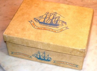
1938 to 1941
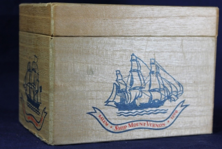
The original packaging for gift sets and mugs was a cardboard
box covered with a
lithographed thin wood veneer. The package showed the Ship
Grand Turk on the top. Around the sides were the Ship
Mount Vernon, the Brig Experiment, Ship Friendship and Ship
Recovery. Since the wood veneer was lithographed in Japan,
it was not available after 1941.
|
|
1942 to 1956
After 1941, the lithographed wood veneer was no longer available
from Japan. A cardboard box was in use until 1956. Its color is
a mottled yellow with a pebbly texture in an attempt to simulate
the original wood veneer. The graphics and ship designs
are identical to the first box.
|
 |
1955 to 1973
A major change in the ship logo first appeared in 1955 and
continued in prominent use until 1973. The ship takes on a
more contemporary look. The hull and masts are now black
and the sails are white. |
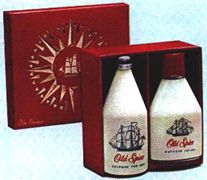 |
1963 TO 1970
The gold compass rose first appeared on gift sets and other
boxes in 1963 and was in use up until 1970. |
 |
1973 to 1976
In 1973, when American Cyanamid bought Shulton, the next major
design change occurred. A series of traditional paintings of
Clipper Ships decorated the tops of the gift set boxes that were
a bright red. Shown here is the "Hamilton." Other
Clippers included the the Wesley, Salem and the Birmingham. |
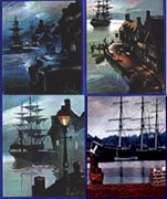 |
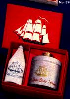
1977 to 1981
In 1977 four gift set packaging designs
were introduced and used until 1981. Clockwise from the
upper left image these were called: New Orleans Harbor
Collection, San Francisco Harbor Collection, Savannah Harbor
Collection and Mystic Harbor Collection. The Savannah
collection appears to be exclusively for travel sets. This
series also introduced the concept of picturing the contents of
the gift set on the outer package against these water color
prints. This innovation remained in the packaging through
the 1990s. (My thanks to Scott Werthmann who
introduced this packaging for Old Spice in 1977 and brought it
to my attention.) |
 |
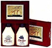
Post 1980
In the 1980s, the packaging for gift sets took on a very
contemporary look, showing the products contained within. |
Bottles
| |
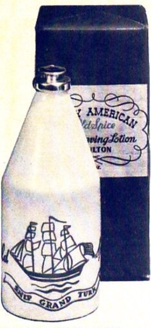
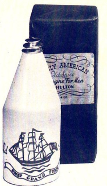
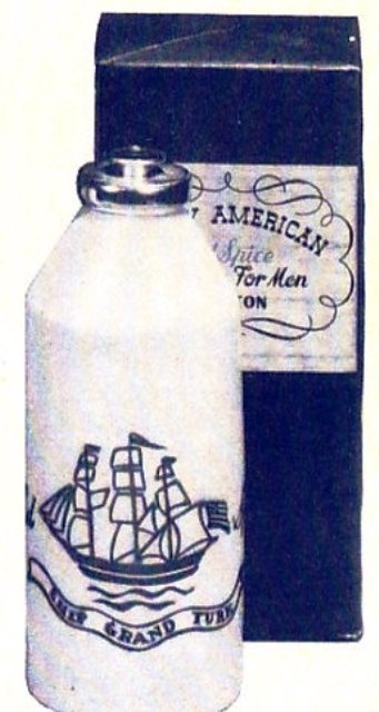
1938 to 1942
The above images are taken from a 1940 sales catalog. I
can not be certain, but the boxes appear to be wrapped in paper.
I also cannot be certain of the color. The y appear to be
blue, but could have been red and printed in a "blue-tone:
format. In any event, the noticeable distinction in these
earliest packages is the distinctive Early American scrollwork
around the label. They intentionally mimic the packaging of Early American
apothecary
stores. |
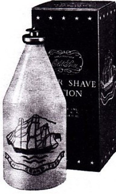
1942 to 1950s
 In
the early 1940s a bottle box was produced with graphics all
around. The box is red with
white graphics and lettering. The distinguishing features
are the row of stars around the top and bottom, the ship graphic
and the Old Spice logo in a scroll similar to the original
packaging, shown here. In
the early 1940s a bottle box was produced with graphics all
around. The box is red with
white graphics and lettering. The distinguishing features
are the row of stars around the top and bottom, the ship graphic
and the Old Spice logo in a scroll similar to the original
packaging, shown here. |
|
|
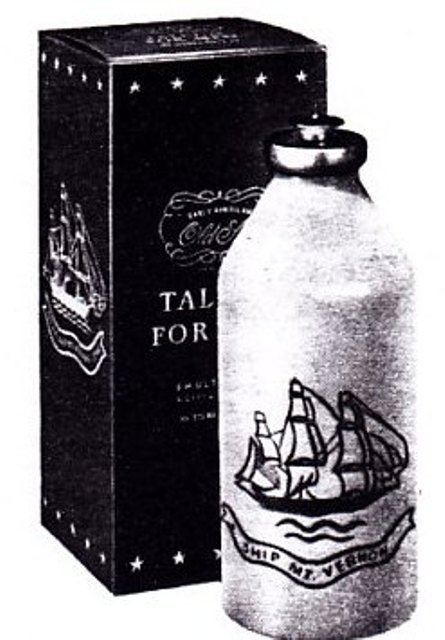
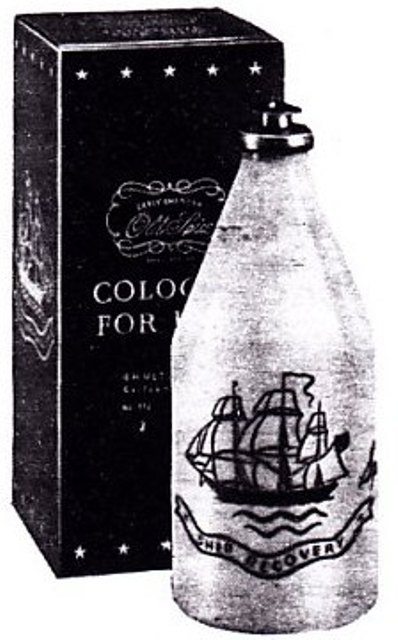
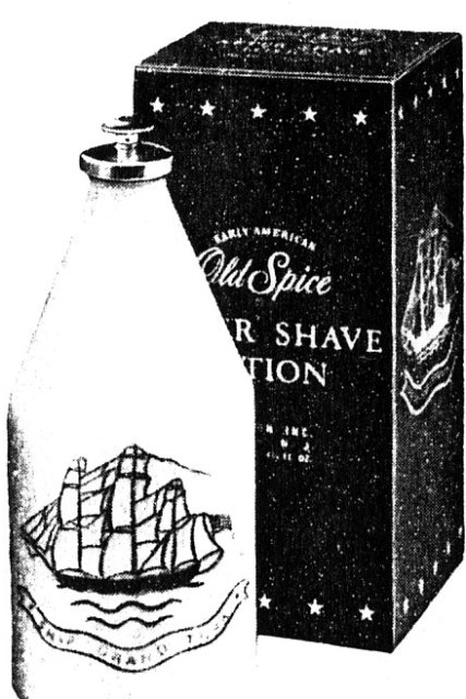
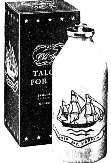
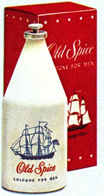
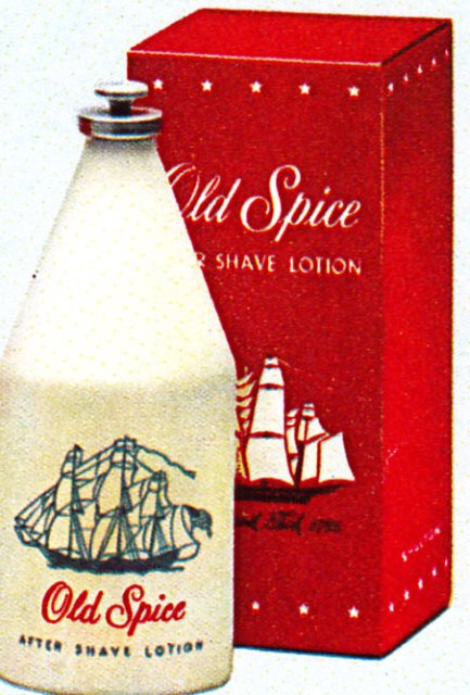
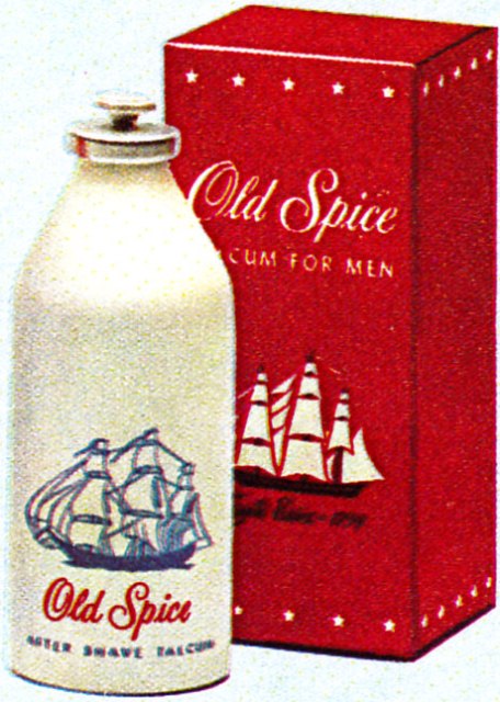
1950 to 1955
In 1950 the packaging started to change again. Note the
after shave and cologne on the left: The scroll work is
gone around a "modernized" script Old Spice. the words
"Early American" appear above in a small arc. A scrolled
Old Spice is still printed in the box top. Note the change
has not affected the Talcum bottle yet - all three of these
images are from the same page of 1952 catalog. The boxes
were red with white graphics and lettering. |
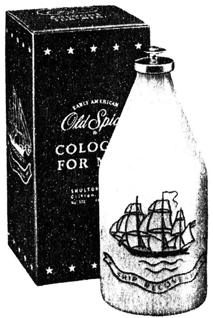
1955 to 1963
By 1955 the transition to a more modern package is complete.
The words "Early American" no longer appear above "Old
Spice" which itself is in a larger more prominent font.
The scrollwork is also gone from the box top. The stars
remain. |
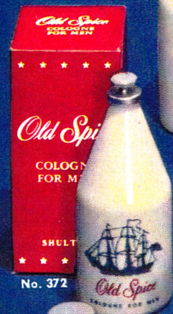
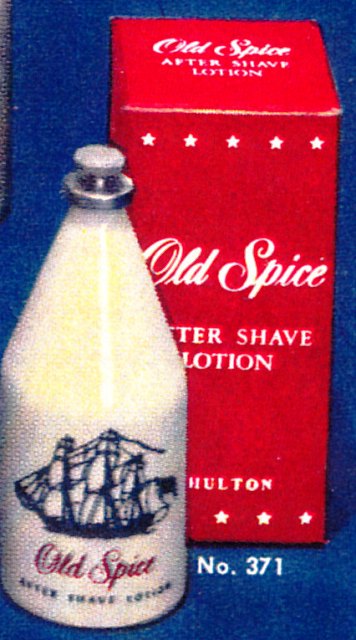
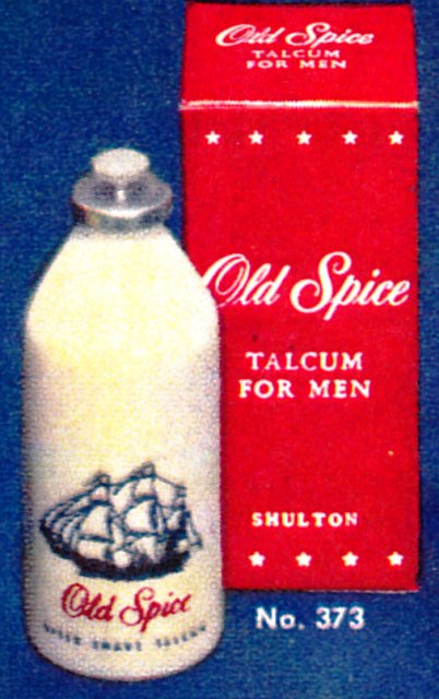
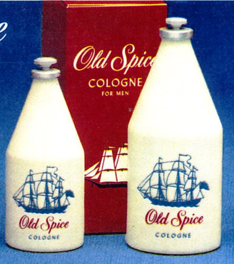
1963 to 1980
By 1963, the ship logo on the bottle boxes changed to
the new black and white style and moves front and center.
Note that the Cologne box changed in 1967. See below. |
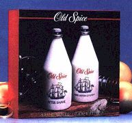
1967 to 1980 Cologne
 |
In 1967 the Cologne box changed. The stars are gone
and the word "Cologne" is more prominent with a more diminutive
"for men" below.
There were no changes to the After Shave or Talcum boxes. |
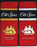 |
1981 to 1990s
This logo change occurred in 1980. The distinctive blue
stripe with the words "Old Spice" is still in use today.
Sometime in the late nineties, however, the traditional
three-masted ship was replaced with a very contemporary racing
yacht. At this time Cologne for Men became known as Long
Lasting Cologne. |
 |
Mid 1990s
This new package and look was introduced in the mid 1990s.
The old clipper ships were replaced by contemporary racing
yachts. This package design change raised a good bit of
ire among the traditional "Old Spicers!" |